Best 25 Website Designs
Choosing the right design for a website requires a solid understanding of the company behind it. Your website should reflect your individual brand, as well as attract your ideal client base. At NUVEW Web Solutions, we’ve had the pleasure of working with companies from a wide range of industries. Our team is committed to building websites that further your digital marketing goals, and we do so by combining various web elements to produce a design that’s perfect for you. Here are our 25 best website designs.
Olivier & Schreiber – Labor & Employment – San Francisco, CA
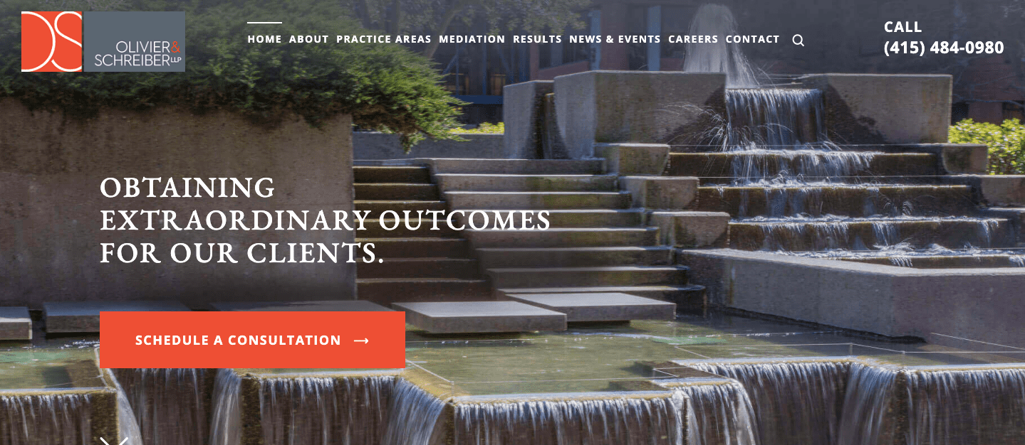
This website shows that simplicity is key. The serif font is similar to that used in a newspaper, which suggests responsiveness and attention to detail. The widgets are highlighted in red-orange when selected, adding visual interest to the otherwise neutral color scheme.
Sverdloff Law Group – Immigration – Chicago, IL
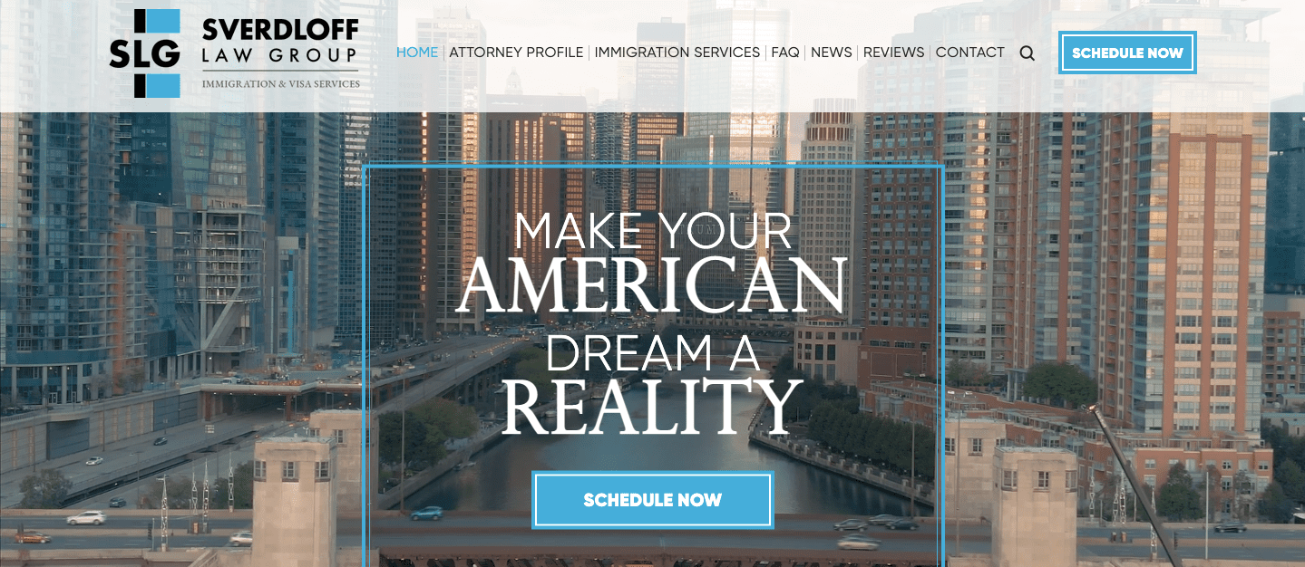
From the color palette to the Chicago imagery, this website is distinguished by its cohesive design. Visuals are separated neatly between key information and geometric graphics for a modern look.
Joseph & Hall P.C. – Immigration – Denver, CO
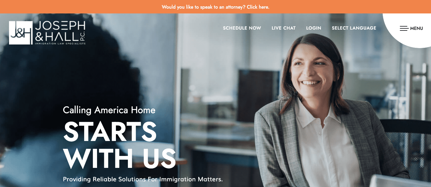
As an immigration law firm, the website contains a lot of complex information, but presents it in an approachable way. The firm showcases their attorney’s compassion, and that mission shines through in the images chosen for the menu page.
Wolford Wayne LLP – Landlord/Tenant – San Francisco, CA
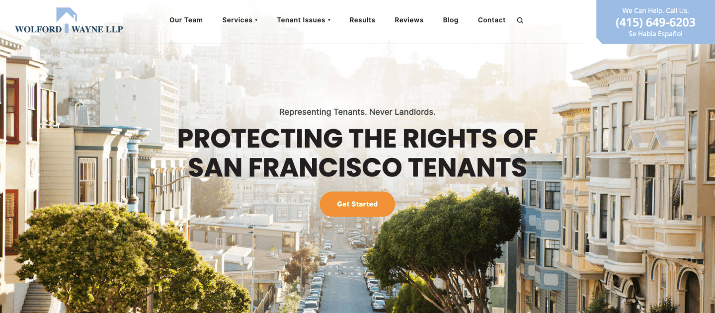
Since the law firm exclusively represents tenants, the content and visuals work together to make its mission clear. The banner images are colorful, yet the softer tones maintain a cohesive theme while portraying San Francisco.
Illiana Christian High School – Education – Dyer, IN
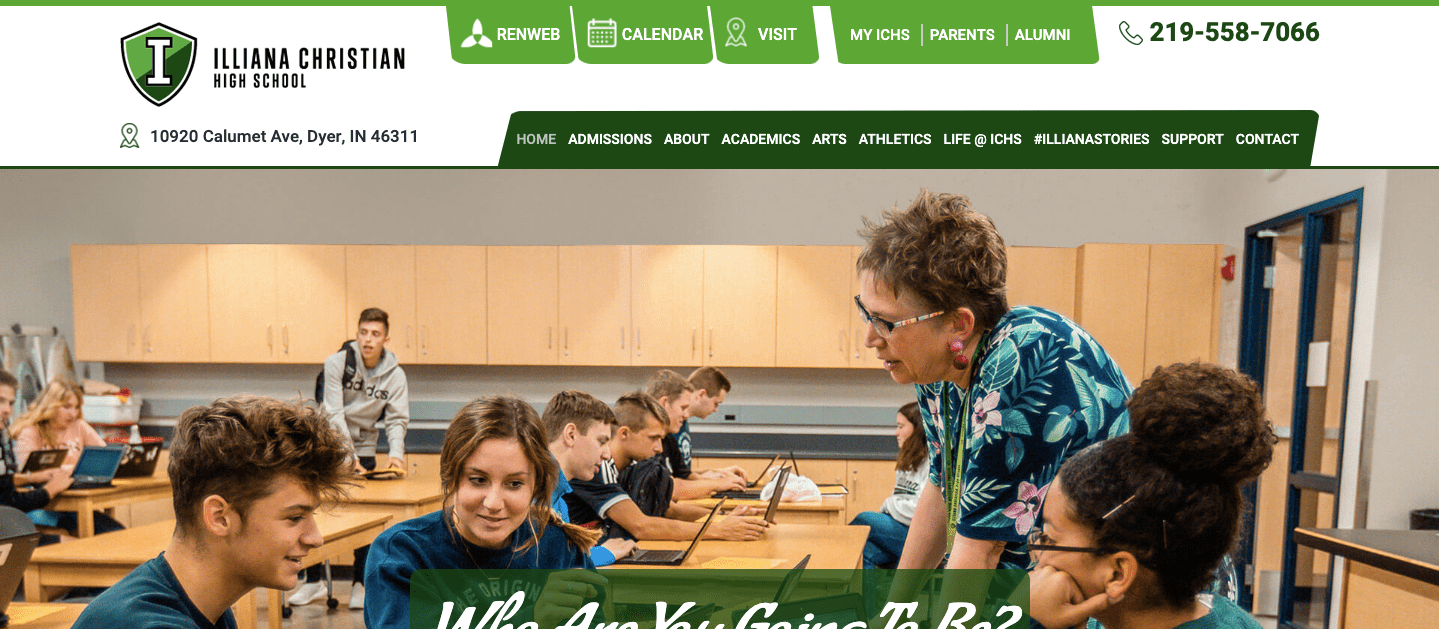
Using a vivid green color palette, this website seamlessly incorporates professionally taken images of the school with written content. The home page features mixed media, including a video, to help prospective students and their families find the information they need. Overall, the design accentuates what makes this school stand out.
Vestal Immigration Law – Immigration Law – Hickory, NC
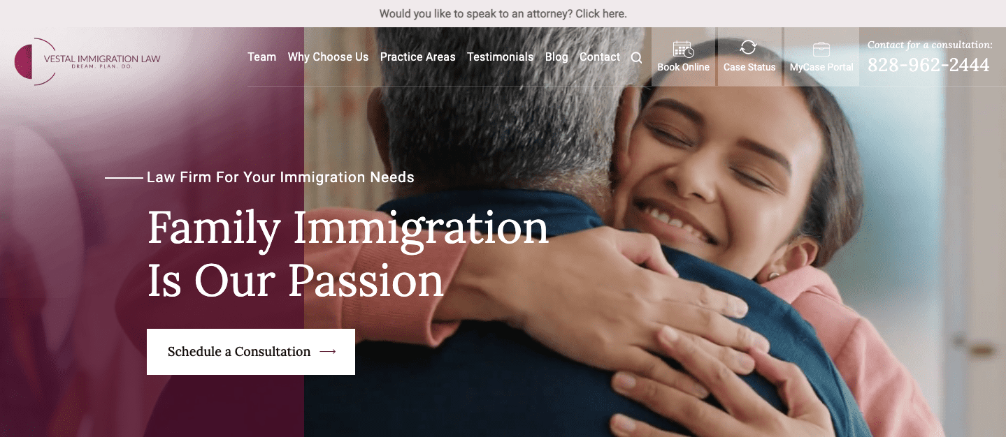
This design maintains an air of authority without coming across as distant. A single glance at the homepage shows that this firm aims to keep families together and makes immigration easier to comprehend with bite-sized process widgets and short paragraphs of content.
The Horwitz Law Group – Injury – Chicago, IL
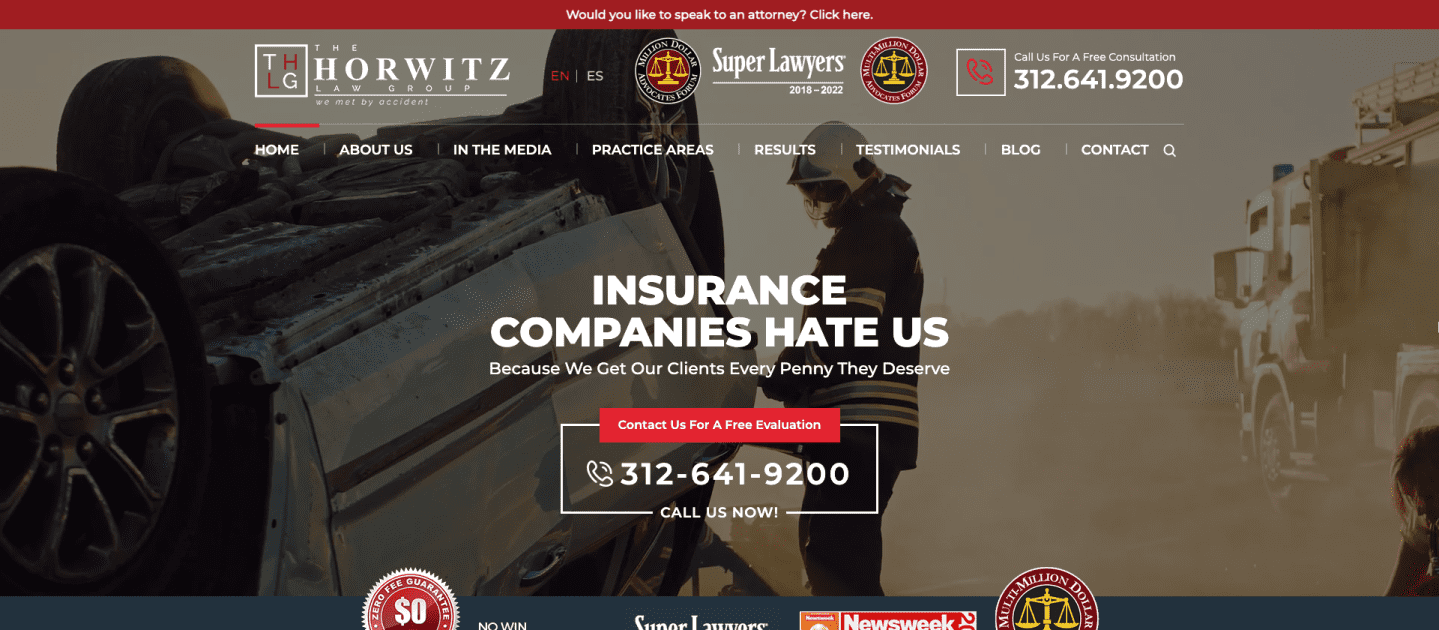
The home page accentuates the firm’s past accomplishments and comes across as very confident. The bold red combined with the shocking reality of a car crash grabs attention while also spurring visitors to learn more.
Blue Lake Animal Hospital – Veterinary Hospital – Caledonia, MI
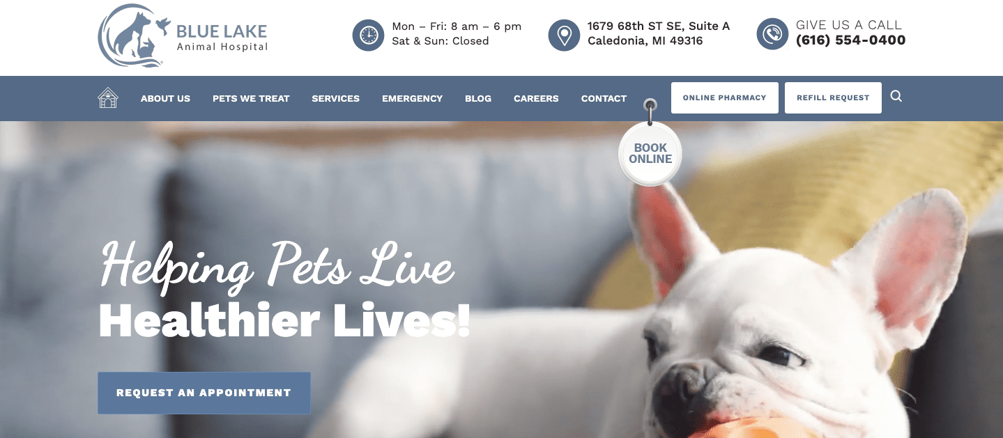
True to their name, the website’s design is mainly a calming blue, which is incorporated in the menu, icons, and images across the site. The banner video features a French Bulldog, a breed that the animal hospital specializes in, which instantly attracts a specific client base. The design provides key information to visitors, and images suggest compassionate veterinary care.
Hammer Serna & Quinn, LLC – Family Law – Chicago, IL
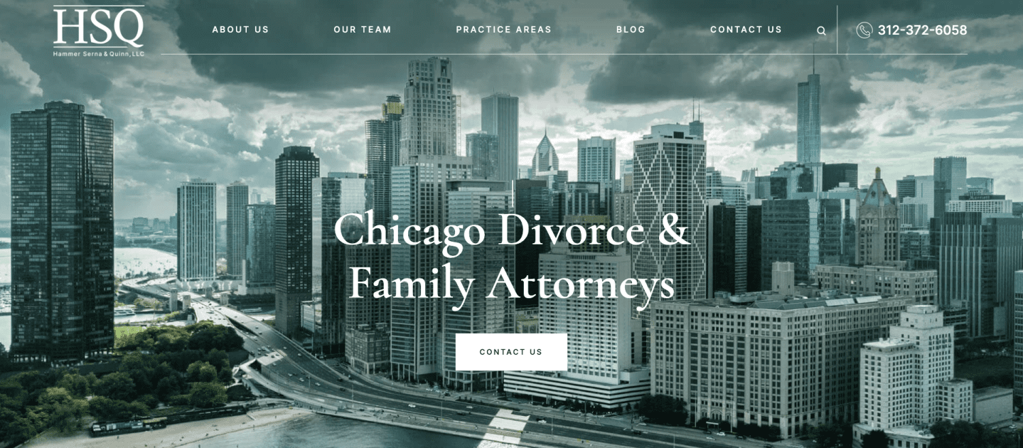
A clean, monochrome header image of Chicago feels fresh and inviting. The site is straight to the point and displays the information that clients are searching for in a tumultuous time.
Bogaards Law – Injury & Employment Law – San Francisco, CA
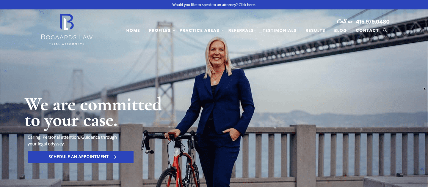
Bogaards Law takes a more personal approach to a legal site by expressing her love for bicycling, which connects with clients who may have been injured on a bike ride. The unified color scheme, combined with blues that match the attorney’s signature suit, creates a distinguished brand.
Law Offices of Robert D. Ahlgren and Associates – Immigration – Chicago, IL
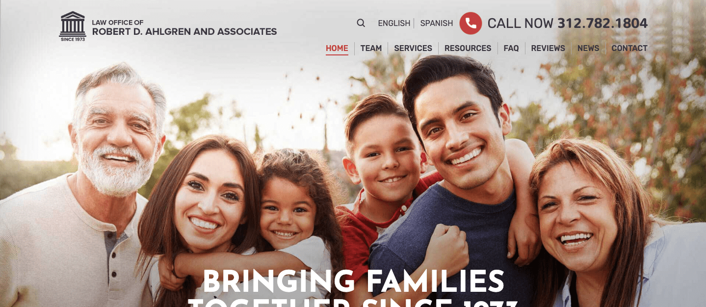
The site emphasizes the firm’s history of excellence while accentuating their mission: to keep families together through dependable immigration representation. The information is presented in a clean way, and the colorful scheme is balanced with plenty of whitespace.
Pinkston Law Group – Injury & Family Law – Chicago, IL
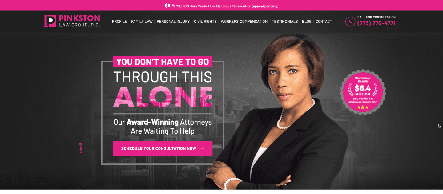
While pink may seem bold for a law firm, Pinkston Law Group uses it to distinguish the firm. The vibrant pink color accentuates various web elements: including widgets, buttons and the practice areas.
Bartolic Law – Long Term Disability – Chicago, IL
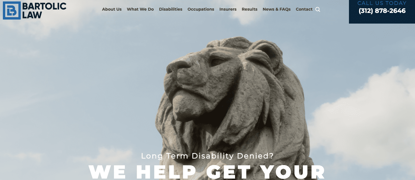
The site is very organized and manages to display a wide practice area of industries represented in a way that’s easy to find. The overall design is simplistic yet interesting thanks to multimedia, including videos.
The Lisa Mullins Team – Realtor – NW IN
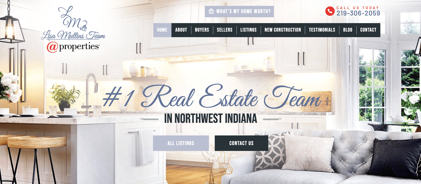
Elegant and airy, The Lisa Mullins Team website is easy-to-use. The home page offers information on available homes and links for both sellers and buyers. By putting the team’s experience at the forefront, clients know they can trust these realtors to achieve their goals.
Steve Smith Trial Lawyers – Criminal Law – Augusta, ME
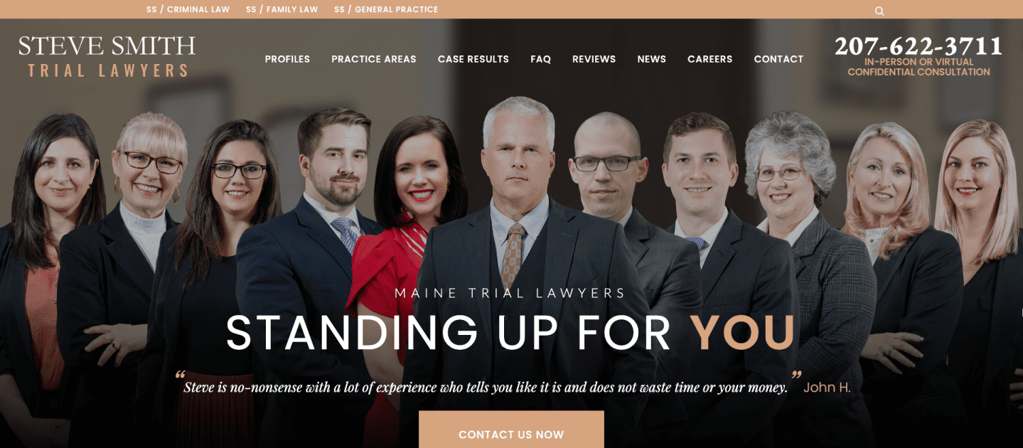
Steve Smith Trial Lawyers takes a firm approach to criminal law, and does not shy away from complicated cases. Visitors will be impressed by the confident, bold tone, which reassures those who are in difficult situations.
Shane O’Donnell – Criminal & Injury Law – Crown Point, IN
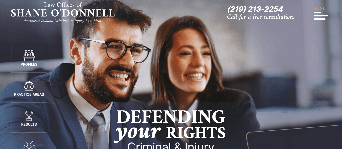
The site balances criminal and injury law by combining empathy with assurance. Clients can see what their practice areas are immediately, and all elements are neatly organized in orange, white and gray boxes contrasted by blue.
Bryan Schwartz Law – Employment Law – Oakland, CA
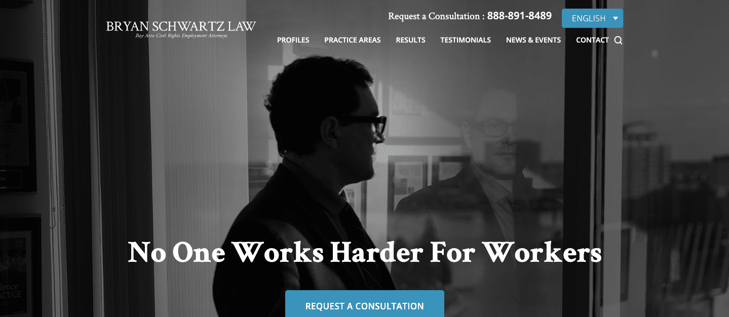
Legal clients are in need of dependable representation, and Bryan Schwartz Law’s website puts that trust at the forefront. The header image, combined with the confident tagline, instantly establishes trust with the client.
Stepping Stones Together – Online Reading Program – Chicago, IL
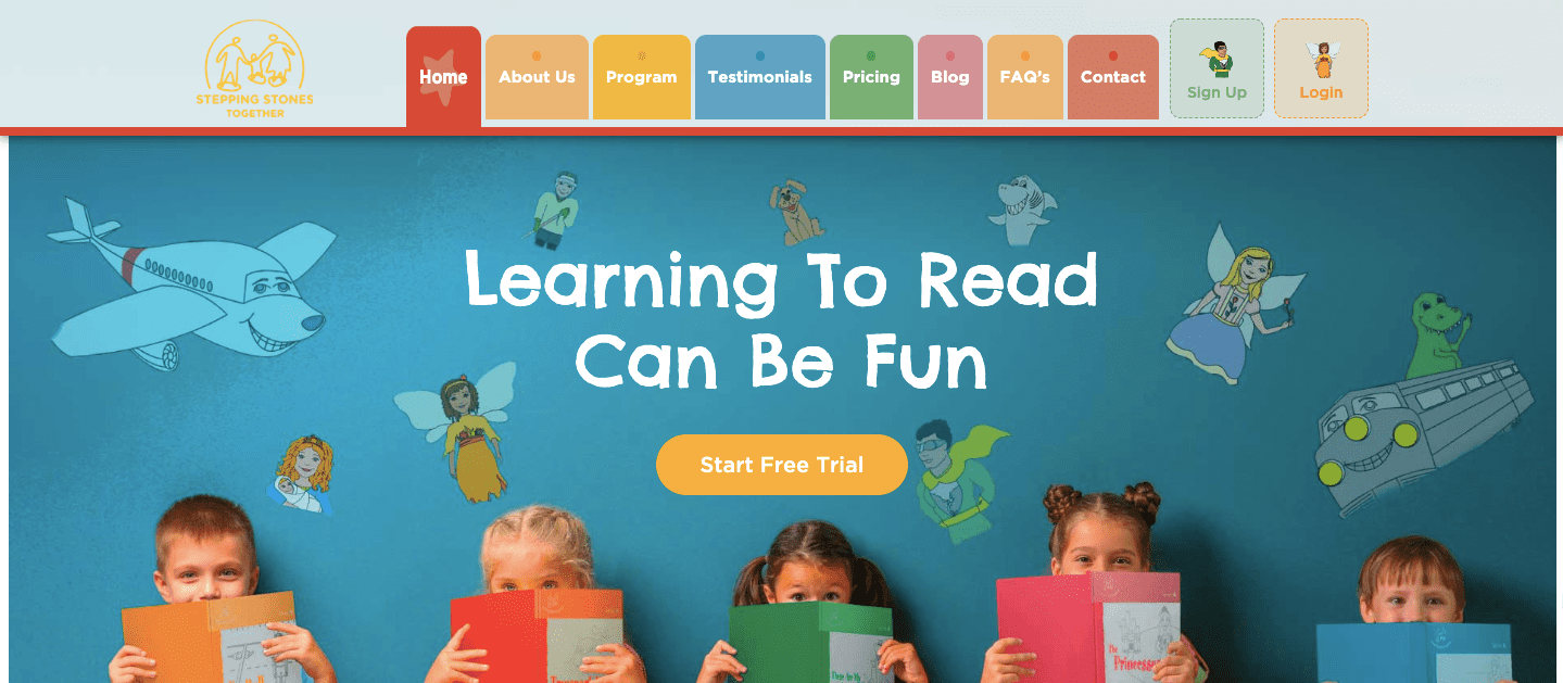
Learning to read can be stressful for both child and parent, so this website takes an encouraging tone. Vivid images are positioned next to detailed information to help clients know what to expect from their product. The design is easy to navigate and clear, which is perfect for busy parents.
Counseling Works – Counseling & Therapists – Naperville, IL
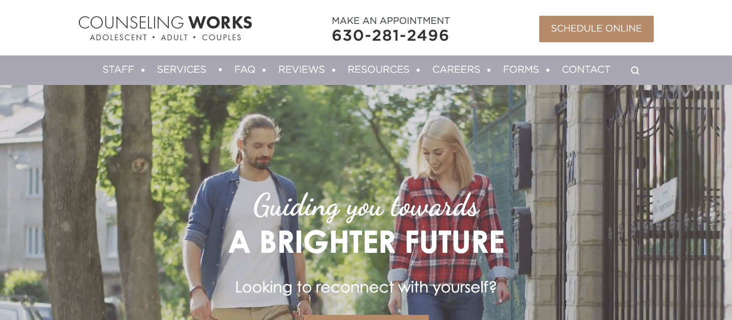
Counseling Works wants to help their patient reach a better place, and that is expressed through the visuals that fill their website. This design uses images of smiling people to produce an optimistic tone despite the sensitive subject matter. Visitors are engaged with the banner’s short video of life’s treasured moments, reminding them of their own goals as they seek therapy. Images of the therapists and offices help clients feel comfortable before they even arrive for their first appointment.
Regan Homes – Custom Home Builder – NW IN

As a custom home builder, Regan Homes showcases their unique flooring plans that clients can choose as they begin their own design. The website relies on image galleries to show rather than simply tell the types of houses that they can build, immediately establishing trust between client and company.
All-Right Sign, Inc – Sign Manufacturer – Steger, IL
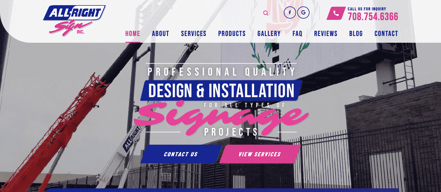
Much like the products they produce, All-Right Sign, Inc has a striking design. The color palette is limited yet catches attention with splashes of bright pink against cooler purples and greys. The home page’s design is chock-full of the products and services they offer alongside actual images of their crew at work.
Brad’s Designs & Jewelry – Jeweler – Crown Point, IN
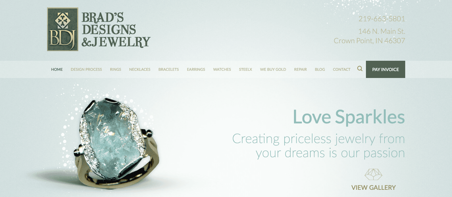
As a custom jeweler, Brad’s Designs uses a clean and simple design. The site cuts right to the chase with a gallery of images, showcasing their best work. The tagline, “Love Sparkles,” makes it clear that their products are perfect as meaningful gifts and timeless keepsakes that are a worthwhile investment.
The Law Offices of Bradley J. Friedman – Criminal – Farmington Hills, MI
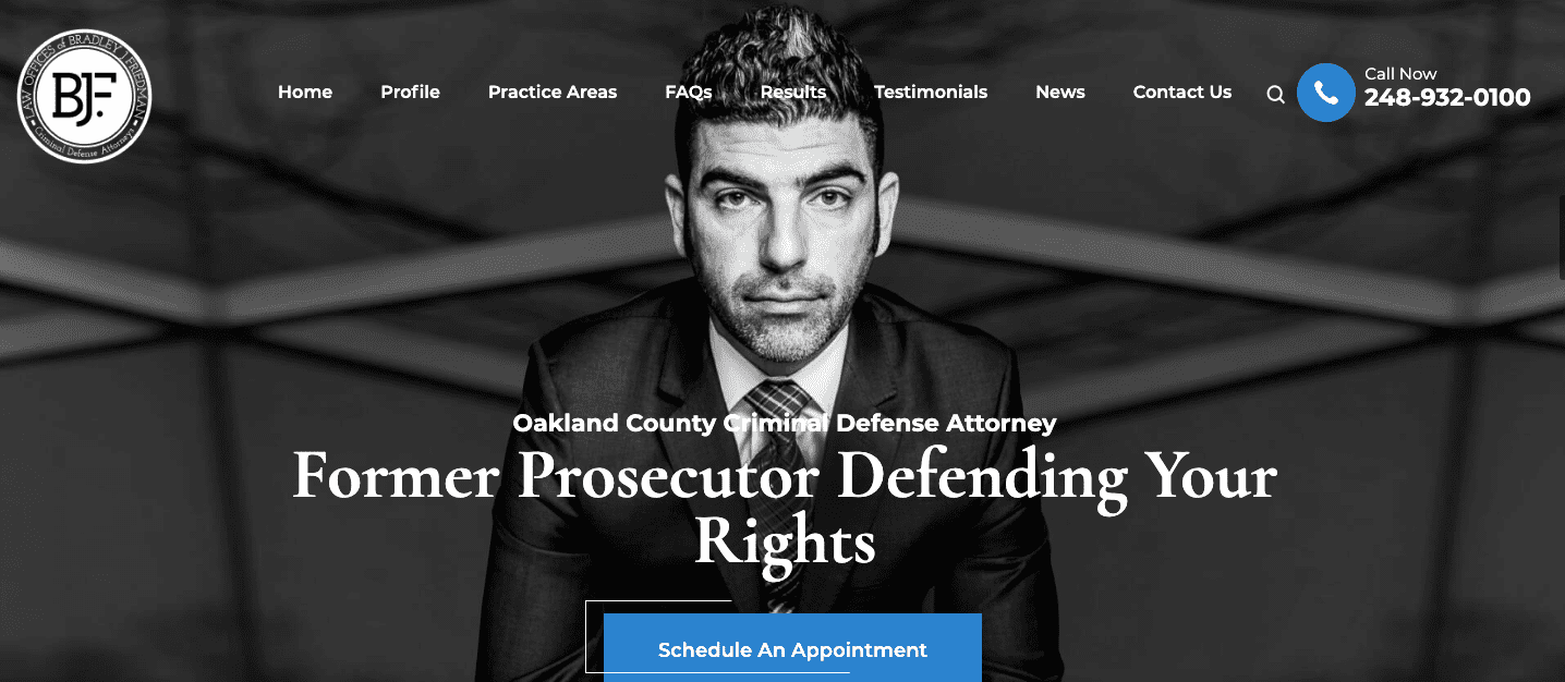
The black and white color scheme, combined with bold header text, gives the impression of a newspaper, and every section is attention-grabbing. It features large portraits of the attorney alongside confident quotes to showcase the attorney’s drive to win his clients’ cases.
Doppler Construction – General Contractor – Crown Point, IN
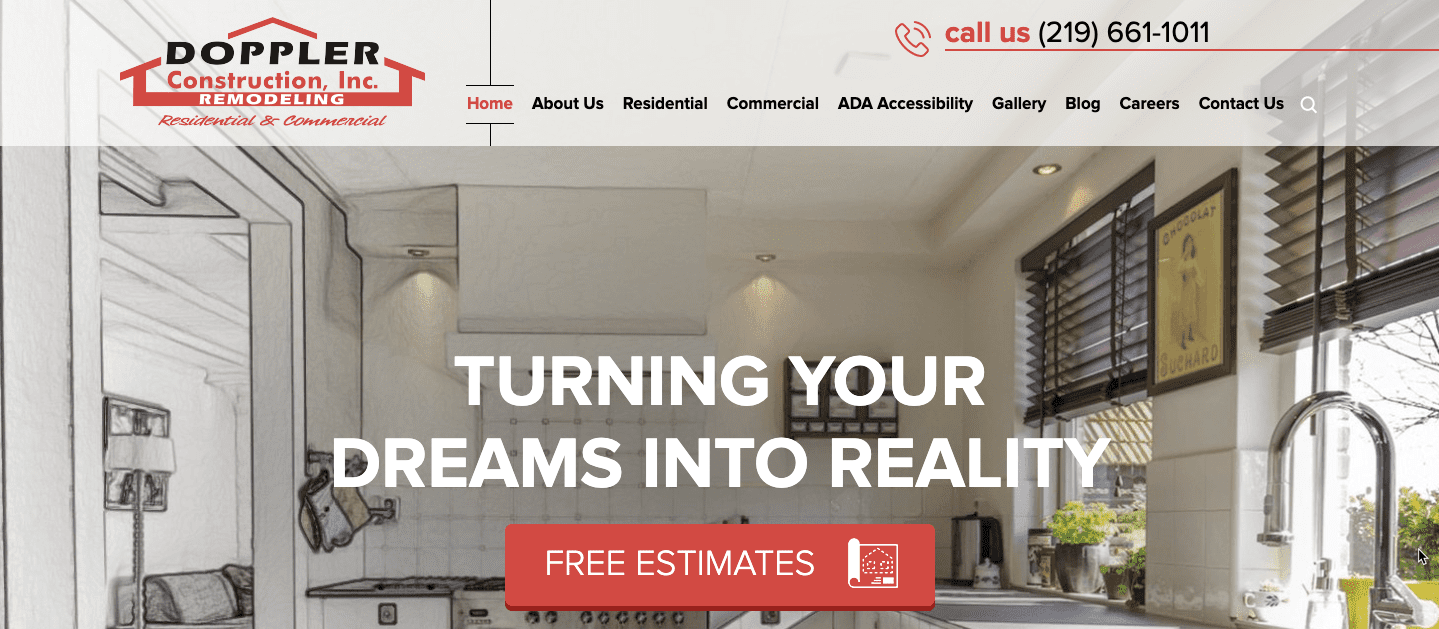
As a construction company serving both commercial and residential clients, their home page shows the full range of their expertise. A large gallery of past products are featured beneath introductory widgets, allowing viewers to imagine how their own property could be transformed.
Distinctive Dental Solutions – Dentist – Crown Point, IN
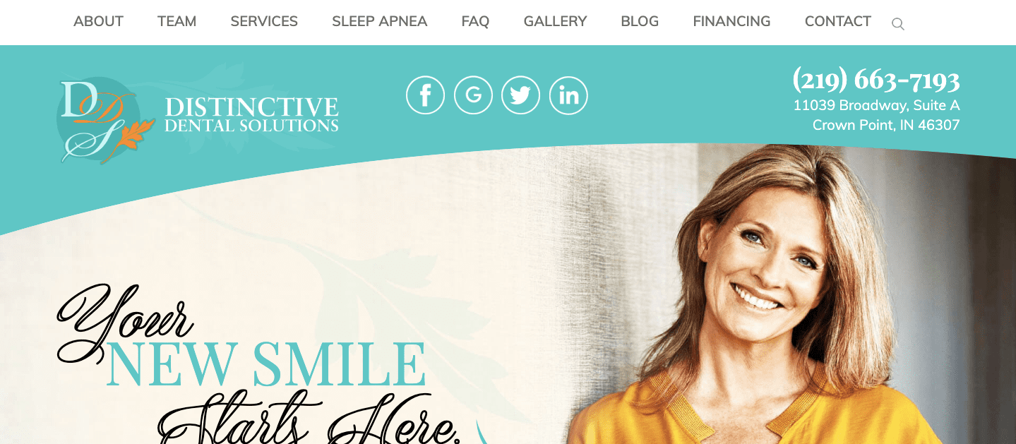
Distinctive Dental Solutions uses vibrant colors and a foliage motif as part of a fresh, memorable design. Since many people feel anxious about getting dental work done, the website’s content takes a comforting tone so patients know that they will be satisfied under their care.
If you’re ready to begin your digital marketing strategy, call NUVEW Web Solutions today to discuss your ideas.
You May Also Like
Similar From Our Blog

Jul, 15 2026

Jul, 08 2026

We Love to Help
Businesses Succeed.
Find out if we are a good fit for you.


NUVEW | Copyright 2026 All Rights Reserved | Terms | Privacy Policy | Accessibility Notice
NUVEW is independently owned and operated and not a subsidiary or affiliated wholly or in part by any other entity. The information on this website is for informational purposes only; it is deemed accurate but not guaranteed. It does not constitute professional advice. Testimonials are not a guarantee, warranty, or prediction of what your experience with us will be. By providing contact information, users acknowledge and give explicit consent to be contacted via the methods of communication provided, including SMS. Message and data rates may apply. Message frequency may vary. Reply STOP to opt out.
1.Compared to previous provider. Cost varies by industry and market. 2 National average across platforms is 1.2%. Average audience growth for Instagram is 1.69% per month. Average audience growth for Facebook is 0.64% per week. Average audience growth for X/Twitter is 0.76% each month. Average audience growth for LinkedIn is 1.58% per month. Data is from May 2024. 3 Compared to previous provider. Average monthly website traffic varies widely by industry, website size, and market. For the legal industry, the monthly average for a small firm is approx. 1,000 visitors per month. NUVEW's average for legal clients in May 2024 was 2,150. 4.National average is 62% as of March 2024 5.Compared to previous provider